Why Your Business Success Relies on a Mobile-Friendly Website

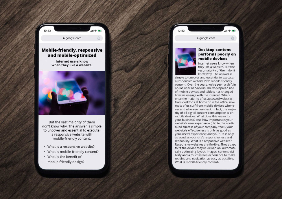
Internet users know when they like a website. But the vast majority of them don’t know why. The answer is simple to uncover and essential to execute: a responsive website with mobile-friendly content.
Over the years, we’ve seen a shift in online user behaviour. The widespread use of mobile devices and tablets has changed how we engage with the internet. Specifically, where once the majority of us accessed websites from desktops at home or in the office, now most of us surf from mobile devices whenever and wherever we want. In fact, most digital content consumption is on mobile devices.
What does this mean for your business? And how important is your website’s user experience (UX) to the continued success of your company?
Well, your website’s effectiveness is only as good as your user’s experience; and your UX is only as good as your site’s responsiveness and readability.
What is a responsive website?
Responsive websites are flexible. They adapt to fit the device they’re viewed on, automatically optimizing layout, images, content visibility and a touchscreen experience to make reading and navigation as easy as possible.
What is mobile-friendly content?
Mobile-friendly content is easy to scan and read on small screens. As a result, information on a mobile-friendly website is quickly scannable for readers who skim while retaining comprehensive content valued by those who read every word. Mobile-friendly content creation strategies include creating smaller chunks of content organized together into sections.
Mobile-friendly web design requires a full strategy to implement, taking into account each element of the website and each stage of the customer experience. In this way, your website can deliver an experience that keeps people coming back.
The benefit of a strategic mobile-friendly web design
Why bother with a mobile-friendly website? Mainly because people expect it. But beyond that, there are very good business reasons to upgrade your website to the most current mobile-friendly web design standards: it benefits your search engine ranking, your brand and your bottom line.
Boost your search engine ranking
Savvy business leaders know how crucial search engine optimization (SEO) is to their rank on a search engine results page (SERP). After all, it helps their website and brand gain maximum traction.
A mobile-friendly website that loads fast, incorporates easy-to-read font sizes and doesn’t distract with distorted images signals a thumbs up to search engines when ranking your website. Without those signals, search engines may penalize your site or not rank your content at all.
Boost your brand reputation
A website redesign focused on increasing the functionality of your site on mobile devices significantly impacts your brand recognition and reputation.
An outdated site that isn’t mobile-friendly comes with significant cost. People usually leave these difficult-to-read, awkward-to-navigate and uninspiring sites to visit websites with a better user experience.
When your brand has a mobile-friendly website, your visitors get an enjoyable experience regardless of the device they use. Your brand shows up consistently visually, which contributes to brand trust and customer loyalty.
Boost your bottom line
With technology companies constantly introducing new devices and software, investing in responsive design and website maintenance is mandatory to ensure your business remains visible and relevant as technology changes. Mobile compatibility attracts more visitors to your content, retains their interest longer and ultimately improves sales. It’s too costly to not make a priority.
Have you looked at your website health lately?
Three signs it’s time to create a new mobile-friendly website
Take a look at these signs and the website statistics that demonstrate why it’s crucial to determine whether your site needs an upgrade.
1. It’s not mobile-friendly
Websites that aren’t configured for mobile devices have had their day. Non-responsive, hard-to-read sites limit user experience, don’t rank as well and aren’t optimized for the majority of search traffic.
- 74% of online users will return to a website that is mobile-friendly
- As of Q2 2022, 58.99% percent of all web traffic came through mobile phones
2. It looks old
A design that was cutting-edge three years ago might fail to meet consumer expectations today. Outdated content may be irrelevant to the current business model and repel desirable leads.
- Users form an opinion about a website in 0.05 seconds
- 57% of users won’t recommend a business with a poorly designed website
3. It is old
Old coding doesn’t play well with modern technology. User experience and search engine optimization require code that supports current standards in speed, security, design, navigation, accessibility and more.
- 47% of users won’t wait longer than two seconds for a website to load
- Websites that load slowly cost retailers $2.6 billion U.S. dollars in sales each year
Does your company need a mobile-friendly website? Book a free discovery call with Mindspin and learn how we can bolster your brand with leading website design and development.


Leave a Reply
Want to join the discussion?Feel free to contribute!